

Spakinect
Connection, quality and accessibility
After 10 years of success, Spakinect engaged TKD to rebrand their business to more accurately speak to its expertise and the future ahead. Spakinect supports medical spas with a centralized telehealth provider network designed to approve patients for treatments. TKD chose three interconnected circles to symbolize the grounded (and vital!) relationship through the three parties: Spakinect, their clients, and their shared patients.
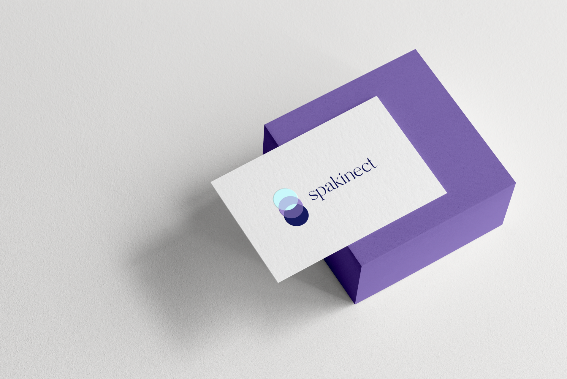
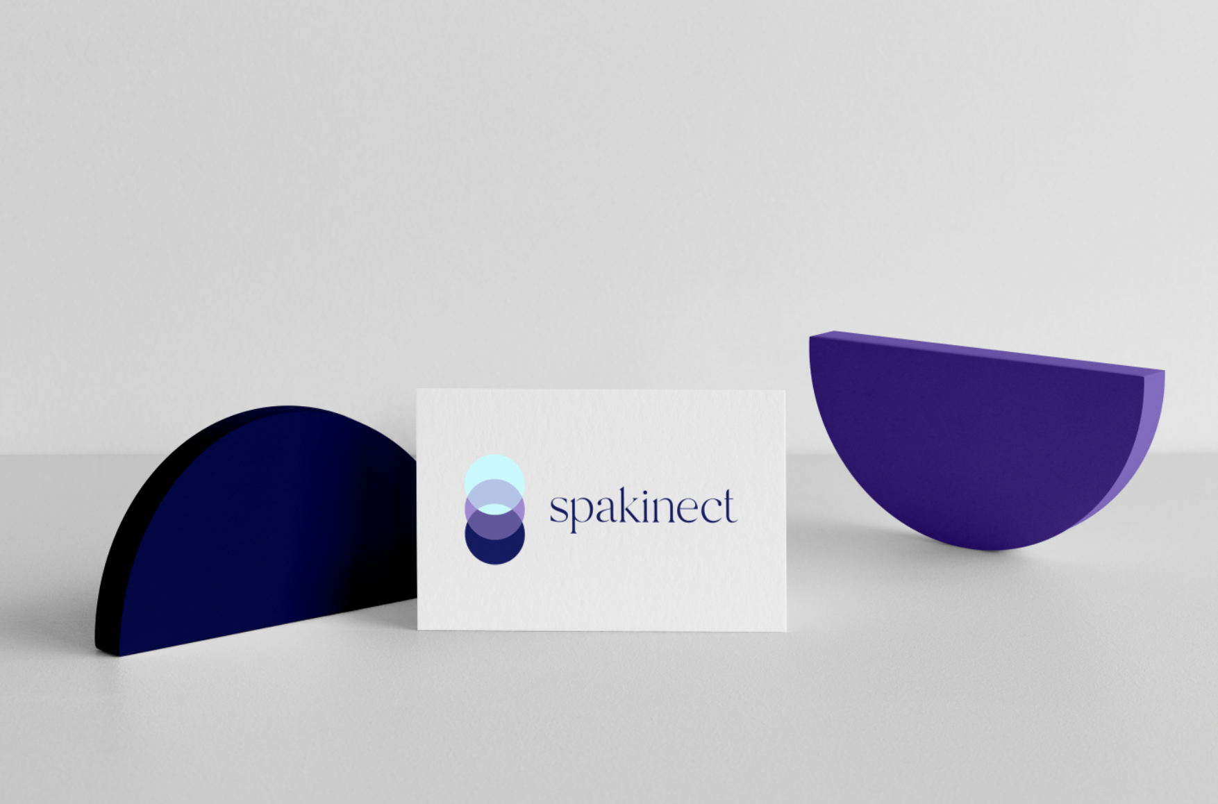
Spakinect logo
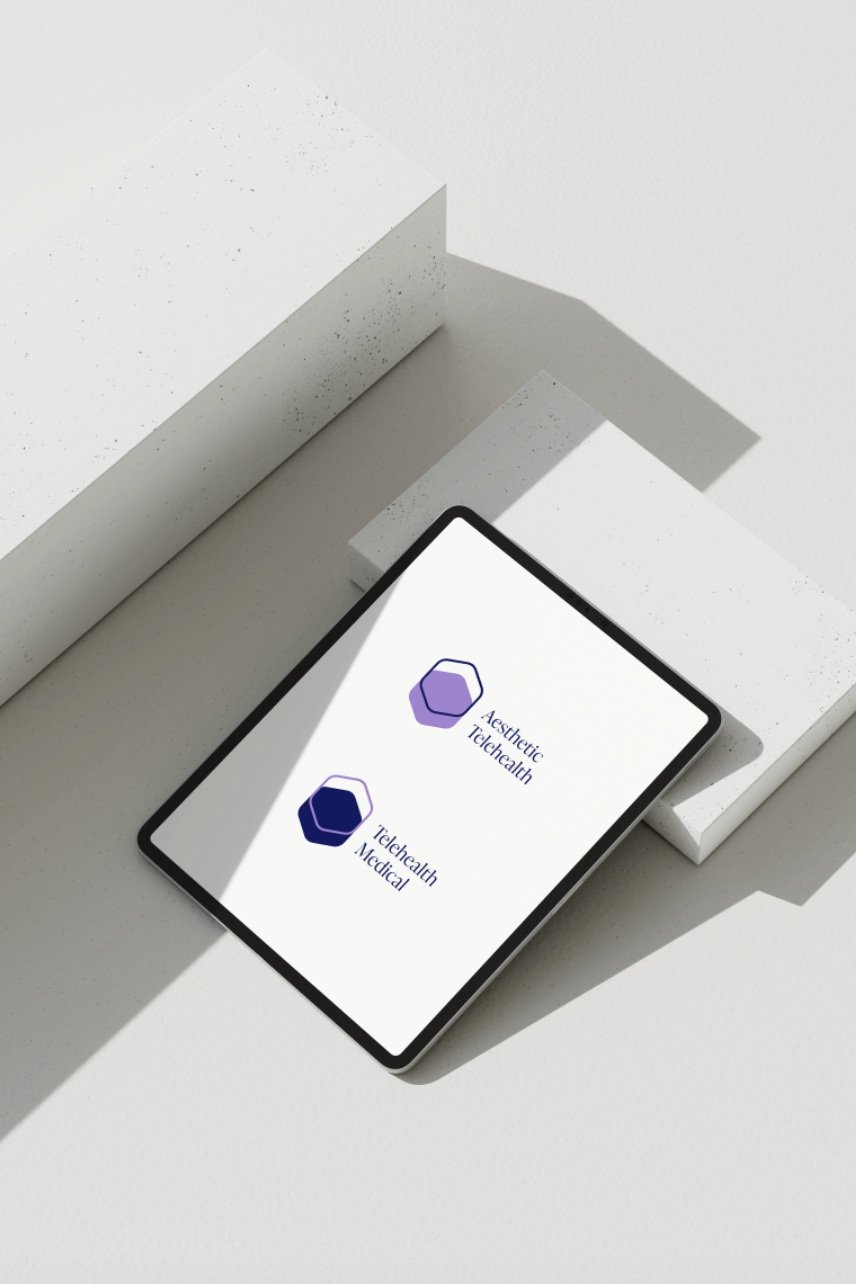
Spakinect sub-brands: Aesthetic Telehealth, Telehealth Medical
“Tiffany delivered good work on our logo redesign project. Her communication was top-notch, she met all deadlines, came in on budget and her skills were exactly what we needed. I enjoyed working with Tiffany and will likely have additional jobs for her in the future.”
— Alain Gazaui, Spakinect
Ready to brand your medical spa?
Tell me more below.

