

List of 4 Logo Variations Your Brand Needs

One of the most important roles of branding is to attract your ideal client to your offering. Logo variations form a logo system that supports your efforts to connect with your dream audience. Rather than settling on a single logo mark to represent your brand, a family of logos allows you the flexibility to show up in many different situations. In this post, I’ll explain what logo variations are, why you need four versions of your logo and where to use each one.
What are logo variations?
Logo variations are versions of your logo designed to represent your brand in different settings. Each logo variation is created with the intention to preserve the integrity of your brand and enhance your brand presence. The design of each logo is cohesive with the shape being the main differentiator.
Why do you need logo variations?
You need logo variations because you plan to create a memorable experience with your ideal client in many settings both online and offline. As you launch your business, you’ll encounter situations where a solo logo doesn’t work well across the board. Managing to squish, stretch, or crop your logo to fit only damages your brand presence. For example, your primary logo is beautiful as your desktop website header yet isn’t legible scaled down to fit your Instagram profile image. Having a logo system with variations on hand solves this problem and strengthens brand recognition across platforms.
How do you know which logo variations your brand needs?
As a brand designer, I work with business owners like you to determine print and digital applications of your logo. The best place to start is by asking yourself where you are currently showing up for your ideal client and where you plan to interact with them in the future. This information informs the amount of logo variations you’ll need to attract your audience.
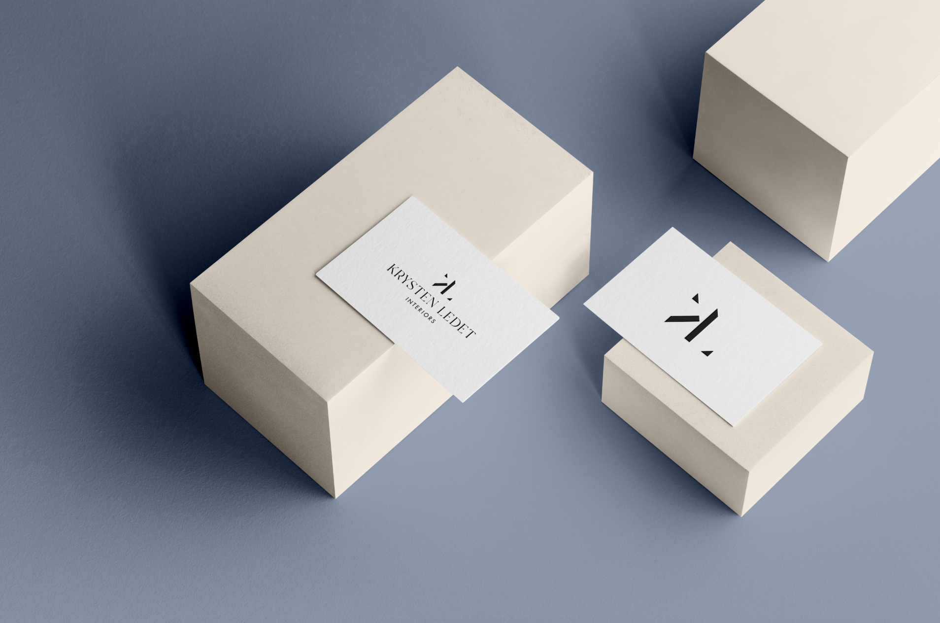
In the examples below, we’ll be showcasing our previous client, Krysten Ledet Interiors. The following are the top four logo variations every brand needs to maintain a consistent brand presence.
1. Primary Logo
Your primary logo is the most complex and detailed variation that you’ll use most frequently. This graphic communicates the most information including your business name and offering. It can include a unique brand illustration, place of operation, year of establishment and a tagline. In the example below (left business card), you’ll see these elements vertically incorporated. Lastly, primary logos require a lot of breathing room (aka clear space) and are best suited for desktop website headers and large print collateral.
Applications: desktop website header, large print collateral such as signage
Branding services for interior design firms by Tiffany Kenyon Design
2. Secondary Logo
Your secondary logo is a rearranged and simplified version of your primary logo designed to step in and serve your brand in the event that your main logo isn’t legible or doesn’t fit the space requirements. When Krysten needs to use for logo to fit the size of an online banner advertisement with lots of horizontal space but limited vertical space, she’d opt for her alternate logo. If she were to use her primary logo, she’d need to scale down the size dramatically rendering it illegible. For this reason, a secondary logo is vital to your brand. In the example below, Krysten’s streamlined secondary logo is better suited to represent her interior design firm where space is limited. When designing a secondary logo, I often remove elements that won’t scale down well, such as the date of establishment. Lastly, if your primary logo is vertically oriented, it’s best if your secondary logo is horizontally oriented. This maximizes each logo’s role in successfully representing your brand.
Applications: mobile website header, social media banner, email signature, small print collateral such as a business card

Tiffany Kenyon Design offers logo design services for architects and interior designers.
3. Submark Logo
Your submark is a simplified logo variation that works as an extension of your brand. They’re compatible with compact spaces and creatively stem from your primary logo. Submark logos work well as watermarks (popular with photographers and videographers), branded stickers, email signatures, or website footers. They can also be useful for branding multi-page print collateral, such as presentation decks or company reports. Your primary logo works well on the first page of a presentation deck but your submark logo steps in to brand the following pages ultimately keeping your business top of mind.
Applications: watermark, website footer, print collateral such as a sticker or presentation deck

Branding for interior design firms by Tiffany Kenyon Design
4. Favicon
A favicon, also referred to as a browser icon, is the smallest logo variation with a very specific mission. It supports your brand by increasing recognition among a sea of browser tabs. To find examples in action, look at the browser tabs you currently have open. A favicon lives in each browser tab to the left of its website title. Without this logo variation, a default favicon unrelated to your brand will be applied. This logo variation adds a professional touch to your brand and often includes a brand illustration or your initials.
Applications: website browser tab

Billboard design for Krysten Ledet Interiors by Tiffany Kenyon Design
I hope this post answered your questions about logo variations and clarified why these four are important to your brand. It’s up to us business owners to create memorable experiences with our ideal client and logo variations certainly help us present ourselves well in many spaces online and offline.
Ready to elevate your branding?
Tell us more about your business below.